
Email marketing continues to be one of the most effective digital marketing channels available to businesses today. Despite the rise of social media, messaging platforms, and new communication tools, email remains a direct and highly profitable way to engage customers. However, the way people interact with emails has changed dramatically over the past decade.
Today, the majority of email opens occur on smartphones and tablets. Whether someone is checking promotional offers during their commute, reviewing a business proposal between meetings, or browsing newsletters while relaxing at home, mobile devices have become the primary gateway to email content.
This shift has created both an opportunity and a challenge for businesses. An email that looks perfect on a desktop screen can quickly become frustrating on a mobile device. Tiny text, broken layouts, oversized images, and difficult-to-click buttons can drive users away within seconds.
For startups, SMEs, enterprises, and growing organizations, designing mobile-friendly emails is no longer optional. It is a critical component of customer engagement, brand perception, and conversion optimization.
In this guide, we’ll explore how to design mobile-friendly emails that create a seamless user experience, improve engagement, and help businesses achieve better marketing results.
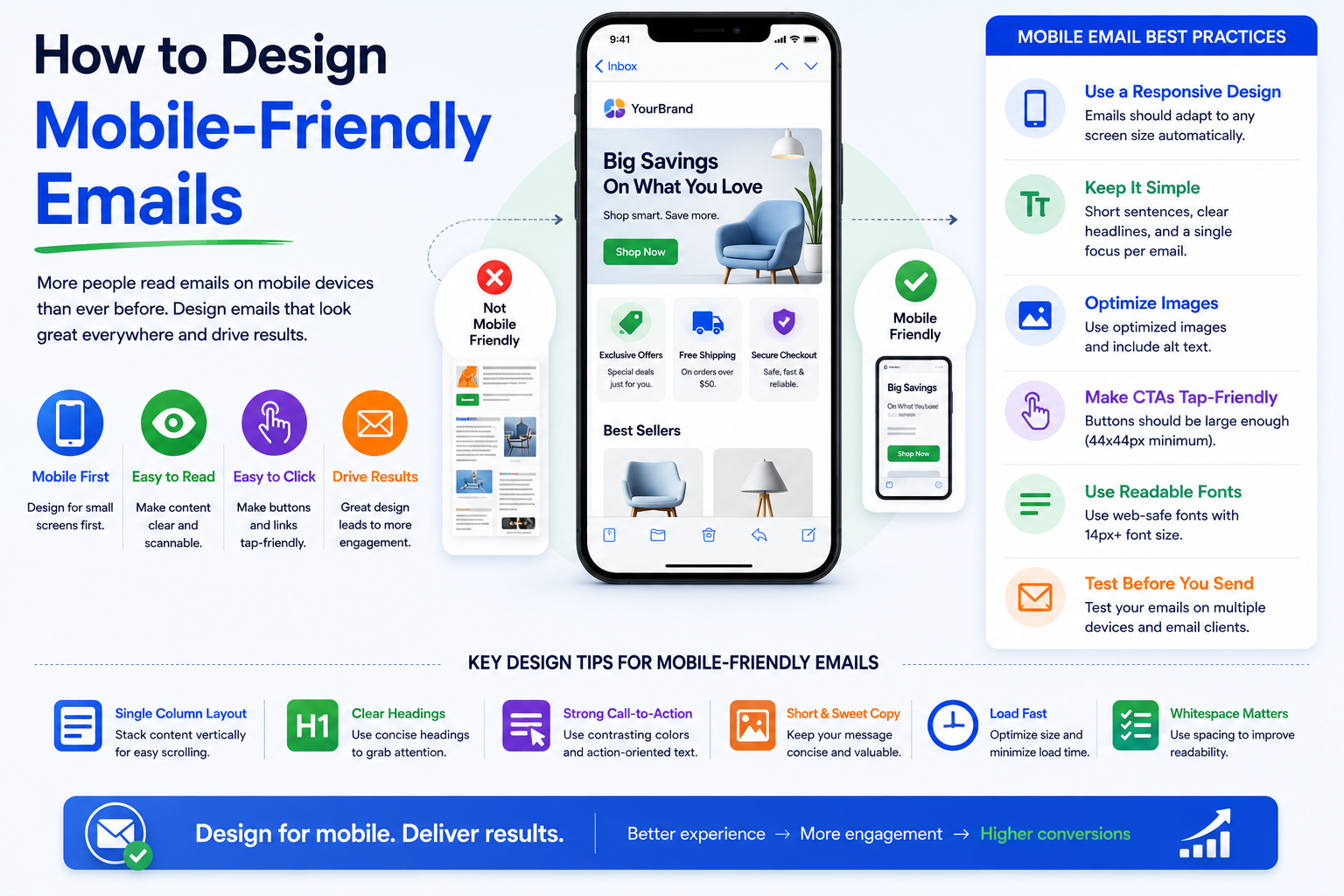
Why Mobile-Friendly Email Design Matters
Consumer behavior has changed significantly over recent years. Industry studies consistently show that mobile devices account for more than half of all email opens worldwide. In many industries, that percentage is even higher.
When recipients encounter an email that is difficult to read on their smartphone, they often delete it immediately or postpone reading it later—which frequently means never returning to it at all.
A poorly optimized email can lead to:
- Lower open-to-click conversion rates
- Reduced customer engagement
- Increased unsubscribe rates
- Negative brand perception
On the other hand, a well-designed mobile email provides a smooth reading experience, encourages interaction, and helps move users through the customer journey more effectively.
Businesses investing in digital transformation initiatives should view mobile email optimization as an essential part of their broader customer experience strategy.
Start with a Mobile-First Mindset
One of the biggest mistakes marketers make is designing emails primarily for desktop users and then attempting to adapt them for mobile devices later.
Modern email design works best when approached from a mobile-first perspective.
Instead of asking how an email will look on a smartphone after completion, begin by designing specifically for smaller screens. Once the mobile experience is optimized, scaling up for desktop users becomes much easier.
A mobile-first approach encourages simplicity. It forces marketers to prioritize the most important content, remove unnecessary clutter, and focus on the actions they want readers to take.
This often results in cleaner, more effective emails that perform better across all devices.
Keep Layouts Simple and Easy to Navigate
Mobile users interact differently with content compared to desktop users. They typically scroll vertically and expect information to be presented quickly and clearly.
Complex multi-column designs can become difficult to read on smaller screens. A single-column layout often delivers the best user experience because it naturally adapts to mobile devices.
Consider how leading technology companies structure their emails. Whether it’s a product update, promotional campaign, or service announcement, the design is usually clean, focused, and easy to scan.
A simple layout helps users understand the message immediately without excessive zooming or horizontal scrolling.
Focus on Visual Hierarchy
Every email should guide readers through content in a logical order.
The most important information should appear near the top, followed by supporting details and a clear call-to-action. Strategic use of headings, spacing, and imagery helps users quickly identify what matters most.
When readers can easily scan an email, engagement naturally improves.
Optimize Text for Mobile Readability
Even the most visually appealing email will fail if users struggle to read the content.
Mobile screens provide limited space, making readability a top priority.
Email copy should be concise, direct, and easy to digest. Long paragraphs can feel overwhelming on smartphones, causing readers to lose interest before reaching the key message.
Several elements contribute to mobile readability:
- Use clear, legible fonts
- Maintain sufficient line spacing
- Break content into short paragraphs
- Create descriptive headings and subheadings
Many successful brands use font sizes between 14px and 18px for body text, ensuring comfortable reading without requiring users to zoom in.
Remember that readability directly affects user engagement and conversion performance.
Design Touch-Friendly Call-to-Action Buttons
Calls-to-action are often the most important elements in marketing emails.
Whether the goal is scheduling a demo, downloading a report, making a purchase, or requesting a consultation, the CTA must be easy to locate and interact with on mobile devices.
Small links designed for mouse clicks frequently create frustration on touchscreens.
Instead, use large, clearly visible buttons with enough surrounding space to prevent accidental taps.
The most effective mobile CTAs typically include:
- Action-oriented language
- High visibility within the design
- Adequate size for thumb interaction
For example, a SaaS company promoting a product trial may achieve better results with a prominent “Start Your Free Trial” button rather than a small text link hidden within a paragraph.
Simple adjustments like these can significantly improve click-through rates.
Use Responsive Email Design
Responsive design is one of the most important technical components of mobile-friendly email creation.
Responsive emails automatically adjust their layout based on the recipient’s screen size and device type. This ensures that images, text, buttons, and other elements remain accessible and visually appealing.
Without responsive design, businesses risk delivering emails that appear distorted or difficult to navigate on mobile devices.
A responsive approach allows content to adapt seamlessly across:
- Smartphones
- Tablets
- Desktop computers
This consistency creates a more professional user experience while maximizing campaign effectiveness.
Optimize Images for Mobile Devices
Visual content plays a major role in email marketing success. Images help attract attention, reinforce branding, and improve engagement.
However, images can also create problems if they are not properly optimized.
Large image files may slow loading times, especially for users on mobile networks. Slow-loading emails often lead to abandonment before the content is fully displayed.
To improve performance, businesses should compress images without sacrificing quality and ensure that visuals scale appropriately across different screen sizes.
Don’t Rely Entirely on Images
Some email clients block images by default, meaning recipients may initially see only text.
For this reason, critical information should never exist exclusively within an image.
Always include supporting text, descriptive headlines, and alternative text attributes so recipients can understand the message even if images fail to load.
This approach improves accessibility while protecting campaign performance.
Prioritize Fast Loading Speeds
Speed matters in every digital experience, including email.
Consumers expect content to load instantly. Delays of even a few seconds can reduce engagement and increase bounce rates.
Several factors influence email loading speed, including image sizes, coding complexity, and the number of embedded elements.
Businesses should regularly review email performance and eliminate unnecessary design components that slow delivery or rendering.
A faster email experience creates a smoother customer journey and increases the likelihood of conversion.
Create Scannable Content
Mobile users often skim content before deciding whether to engage further.
Instead of forcing readers to process large blocks of text, structure emails so information can be absorbed quickly.
Clear headings, concise messaging, and logical content sections help readers find relevant information faster.
Consider a software company launching a new feature. Rather than presenting multiple paragraphs explaining every detail, the email can highlight the primary benefit, provide a brief explanation, and direct users to a landing page for additional information.
This approach respects the user’s time while maintaining focus on the desired action.
Test Across Devices and Email Clients
One of the biggest challenges in email design is consistency.
An email that appears perfect in one application may display differently in another. Variations between email clients, operating systems, and devices can affect layout, fonts, and functionality.
Before launching any campaign, comprehensive testing is essential.
Businesses should evaluate how emails appear across popular platforms and identify any display issues that could impact user experience.
Regular testing helps prevent costly mistakes and ensures recipients receive a polished, professional message regardless of their preferred device.
Use Personalization Without Sacrificing Simplicity
Personalization has become a powerful tool in modern email marketing.
Customers increasingly expect brands to deliver relevant content tailored to their interests, behaviors, and needs.
However, personalization should enhance the mobile experience rather than complicate it.
Effective personalization may include product recommendations, customized offers, or location-based content. The key is maintaining a clean design that keeps the user experience simple and intuitive.
Many leading e-commerce companies successfully combine personalization with mobile-friendly design to drive higher engagement and revenue.
Accessibility Should Be Part of Every Email Strategy
Accessibility is often overlooked during email design, yet it plays a crucial role in creating inclusive customer experiences.
Mobile-friendly emails should be accessible to all users, including those with visual impairments or other disabilities.
Good accessibility practices include sufficient color contrast, descriptive alternative text, logical content structure, and readable typography.
Beyond compliance considerations, accessible design improves usability for every recipient.
Organizations that prioritize accessibility often see broader engagement and stronger customer trust.
Common Mobile Email Design Mistakes to Avoid
Many businesses unknowingly reduce email effectiveness through avoidable design errors.
Some of the most common issues include tiny fonts, oversized images, excessive content, cluttered layouts, and poorly positioned call-to-action buttons.
Another frequent mistake is focusing heavily on visual design while neglecting actual user experience.
Successful email marketing is not about creating the most visually complex message. It is about delivering the right message in the simplest and most accessible way possible.
When businesses focus on usability first, results often improve naturally.
The Future of Mobile Email Design
As mobile usage continues to grow, email design will become increasingly centered around convenience, personalization, and user experience.
Artificial intelligence, predictive personalization, dynamic content, and interactive email elements are already reshaping how brands communicate with customers.
At the same time, user expectations continue to rise. Consumers expect fast-loading, visually appealing, highly relevant content that works flawlessly across devices.
Organizations that invest in mobile optimization today will be better positioned to compete in the evolving digital landscape.
Mobile-friendly email design is no longer just a marketing best practice—it is a business necessity.
Conclusion
Designing mobile-friendly emails is one of the most effective ways to improve customer engagement, increase conversions, and strengthen brand perception.
As more users access emails through smartphones and tablets, businesses must prioritize responsive design, readability, touch-friendly interactions, fast loading speeds, and accessibility.
The most successful email campaigns are not necessarily the most elaborate. They are the ones that provide a smooth and intuitive experience for recipients regardless of device.
Whether you are a startup launching your first email campaign, an SME looking to improve marketing performance, or an enterprise pursuing digital transformation, investing in mobile-friendly email design can deliver measurable long-term benefits.
The future of email marketing belongs to organizations that put user experience first.
Frequently Asked Questions
What is a mobile-friendly email?
A mobile-friendly email is designed to display properly on smartphones and tablets. It includes responsive layouts, readable text, optimized images, and touch-friendly buttons that improve user experience.
Why is mobile email optimization important?
Mobile optimization is important because the majority of email opens now occur on mobile devices. Poor mobile experiences can reduce engagement, clicks, and conversions.
What is responsive email design?
Responsive email design automatically adjusts content based on screen size and device type, ensuring emails remain readable and functional across smartphones, tablets, and desktops.
What font size is best for mobile emails?
Most email marketing experts recommend using body text between 14px and 18px to ensure readability on smaller screens.
How can businesses improve email click-through rates on mobile?
Businesses can improve mobile click-through rates by using clear call-to-action buttons, concise content, responsive layouts, fast-loading images, and personalized messaging.
Ready to Improve Your Email Marketing Performance?
Creating effective mobile-friendly emails requires more than attractive design. It demands a strategic combination of user experience, responsive development, performance optimization, and marketing expertise.
If your organization is planning to enhance customer engagement, modernize marketing operations, or accelerate digital transformation initiatives, partnering with the right technology and marketing experts can make all the difference.
Choose a trusted technology partner that understands mobile-first design, customer experience optimization, and data-driven marketing strategies to help your business achieve sustainable growth in an increasingly mobile world.